I don’t know toki pona, what is this about?
toki pona is a philosophically minimalist constructed language, created by Sonja Lang in 2001, you can read more about it here. The number of words hovers around 130, but is always in flux, and recently Sonja published a dictionary that highlights a number of words either left out of her first book in 2014, or that had been coined in the community since then. This is the story of designing sitelen suwi hieroglyphics for these words.
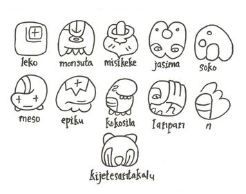
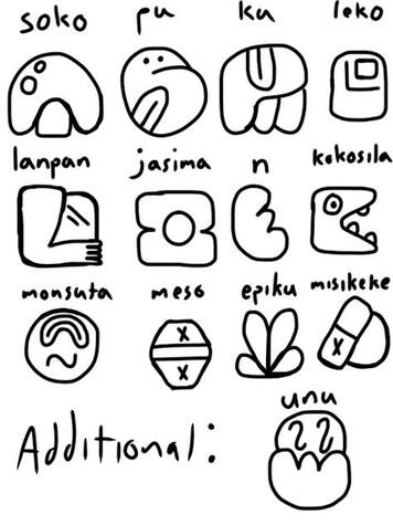
With the publication of ku, and the elevation of nimi ku suli, there was an interest in new sitelen suwi to celebrate their place in the lexicon. Some of these were pre-pu, and already had glyphs: namako, kin, oko, and kipisi. And tonsi was added last year.
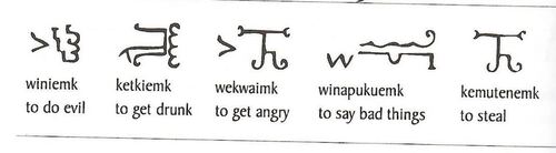
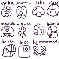
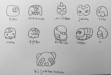
That left 11 more glyphs to design: leko, monsuta, jasima, kijetesantakalu, soko, meso, epiku, kokosila, lanpan, n, and misekeke.
Just as so many of the nimi sin came from the community, several toki pona speakers reached out to me to say they had already started playing around with some ideas. This presented a fantastic opportunity to do something I hadn’t tried before, to see if we couldn’t pool our ideas and design the glyphs together.
The experience was really awesome, so much creativity and enthusiasm, and a surprisingly common consensus in the end as to the final versions.
The drawings you see below were made by lon Jawin, jan Pensa, jan Saki and myself. Additionally Nundrum, Skymandr, and jan Temili provided a lot of useful feedback along the way that helped guide the process.
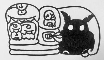
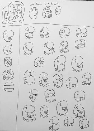
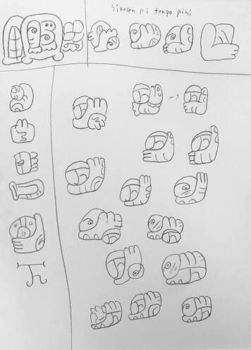
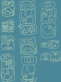
open la
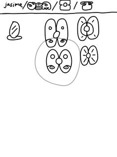
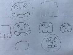
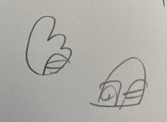
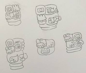
We started with a group of glyphs present by lon Jawin, and the two versions of kijetesantakalu below.
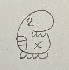
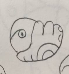
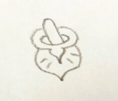
kijetesantakalu
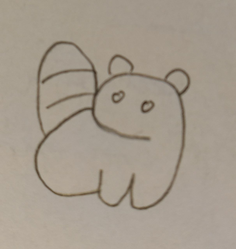
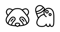
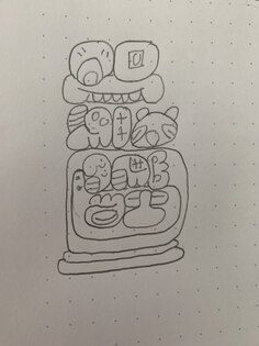
For kijetesantakalu, jan Saki came up with a glyph similar to the current soweli, and jan Pensa had a full body version based off of the sitelen pona glyph, which was further simplified by palisa jelo Natan. Both felt pretty good as they were and didn’t need any refinement. We decided to go with the close up, but if you are partial to the other one, no one will stop you from using it, ears or no ears.
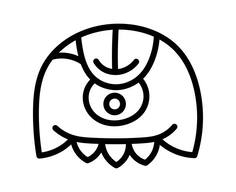
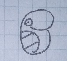
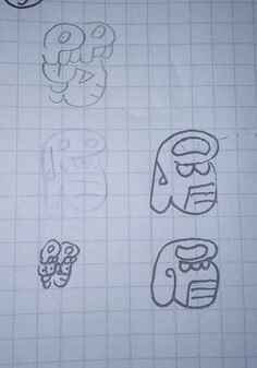
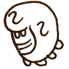
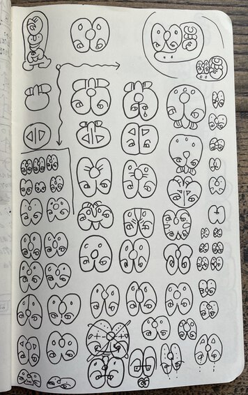
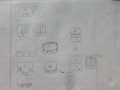
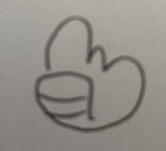
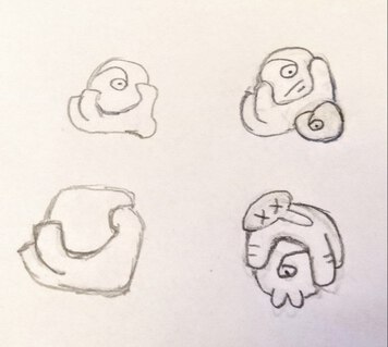
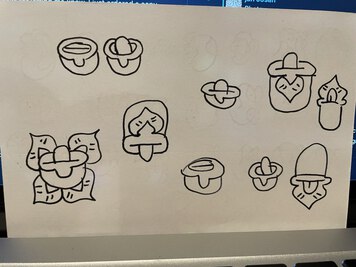
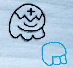
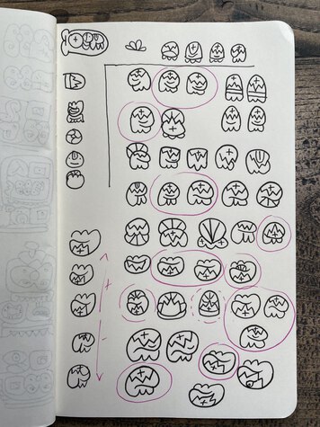
monsuta
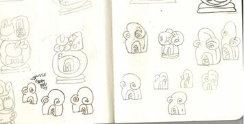
I dug up an old notebook that had some sketches for monsuta in it, and taking that and the other versions from lon Jawin, jan Saki iterated on the glyph.
This is a pattern that we used fairly often, and something I find particularly useful. On the top row you see the main selections from any previous versions. On the left any glyphs that are either related in concept, from which to draw inspiration, or related in shape, so we could make sure they were distinct enough from each other.
You can see at the end of this they came up with one they liked particularly well, and this ultimately became the final version. One thing you will notice in this one and many of the other versions was an attempt to incorporate all of the vowels (o, u and a) into the glyph. jan Saki went further and also added the cross-bar from the t syllable container into the u.
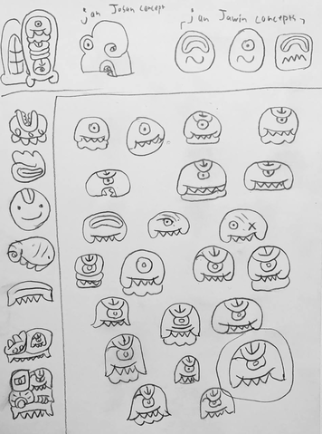
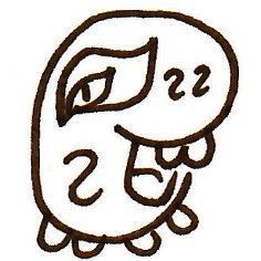
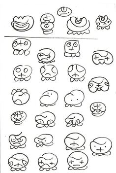
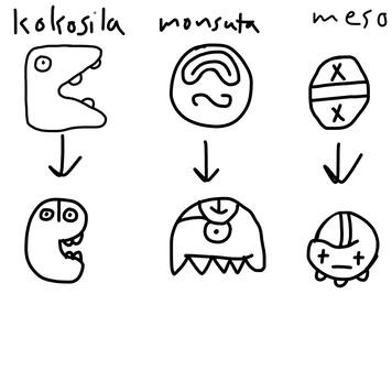
kokosila
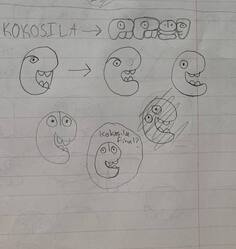
Starting with two versions by jan Temili, and one by lon Jawin, jan Saki again iterated, combining elements of each. If you take a good look at the first version by jan Temili, you will notice it is the toki glyph with the mouth on the wrong side. This tongue-in-cheek take on kokosila remained with us through the process.
We liked a lot of the variations, and also came up with a fun rule for kokosila, that you can (should?) add or alter something about the original glyph, so that it’s always out of place and not following the rules.
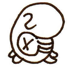
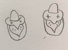
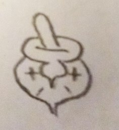
jasima
lon Jawin again came up with a version of jasima and the final glyph stayed pretty true to the original. After I field tested it, we decided we preferred the versions where the line separating the two halves was less distinct.
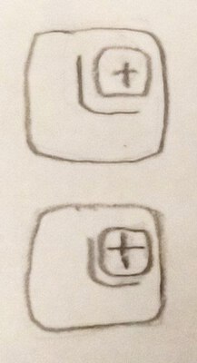
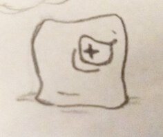
meso
Taking lon Jawin’s sketches for meso, jan Saki and I both iterated on it, arriving at the final version.
When drawing the glyphs to put into the dictionary, I ended up reducing the eyes further, and dropping the middle leg so that it sits more easily on top of another glyph block.


Just like musi, the expression on meso can vary from a smile to a frown, giving an additional emotional queue to your glyph block’s meaning.
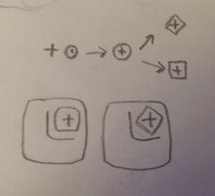
n
The glyph for n came pretty quickly. Starting with the n container from the syllabary, we were looking for something else to fill it in so it didn’t feel so empty. The uta (mouth) radical, which had already made it into kokosila seemed like a perfect choice. This allows n to tie back to the other interjection, a, which also shares this radical.
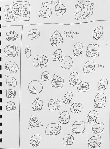
lanpan
Taking the basic form of lanpan from lon Jawin original, jan Pensa and jan Saki moved the forms around to find a more settled arrangement.
lanpan was one glyph where we were able to reference some existing source material, and pay a little debt to two real written languages that exist outside of the Latin alphabet: Mayan and Mi’kmaq

jan Saki again used our standard format to refine and combine the versions
o lanpan ala e ni!
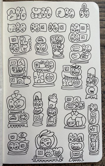
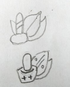
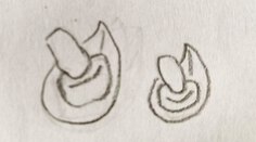
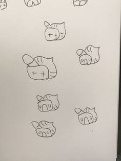
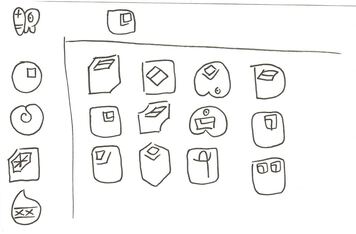
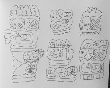
misekeke
misekeke was one that presented a lot of options before we arrived at the final form. The main themes that we kept bringing back were references to kasi, and a mortar and pestle, for which we eventually turned back to the existing poki glyph.
lon Jawin started us off:
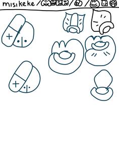
jan Saki refined the options:
jan Pensa pulled out the main elements and began looking for an option that was more distinct from the current meso:
lon Jawin took a turn iterating:

jan Saki again refined and tested in a sentence next to kasi
I tried out some new things:
jan Saki took a turn:
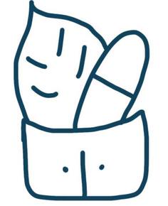
And this led jan Pensa to the final glyph:
leko
The glyph for leko also stayed pretty true to lon Jawin’s original, jan Pensa ended up finding the final touch, adding the e phonetic radical inside.
taking stock
At this point we took a look at where we were and felt pretty happy. the last one to tackle was going to be epiku.
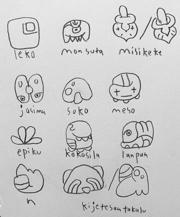
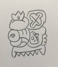
epiku
jan Pensa and jan Saki talked about making a new glyph with influences from wawa and pona. lon Jawin iterated on the previous version, and added a little personality.
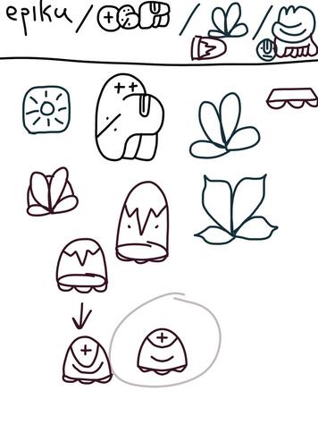
jan Saki brought in the lightening from wawa:
and jan Pensa brought it to it’s conclusion:
I put it though it’s paces, but couldn’t improve the design, although I do like the one that is ‘upside-down’. Others found this one too similar to pona.
as jan Saki said to jan Pensa:
pini la
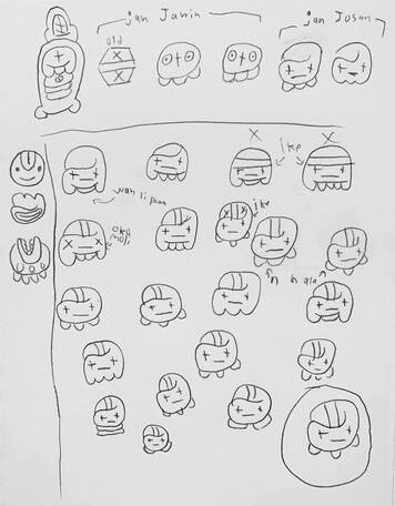
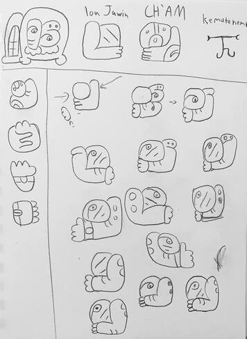
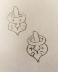
Finally, we had our new nimi ku suli. lon Jawin collected the results and tested them out in some sentences:
and jan Saki did this as well:
The very first images above for kijetesantakalu were posted the Telegram on July 7. The very first collection by lon Jawin above was shared with the group on July 24th, and the completed collections by lon Jawin and jan Saki directly above are from July 30th. The final versions were made on August 5th, in time to share them for suno pi toki pona. It’s amazing to me to realize the bulk of the collaboration was completed in a single week.
It has often occurred to me that visual artists don’t encounter opportunities to collaborate as often as musicians, dancers and artists in other media do. If this fits your artistic experience, I highly encourage you to seek out a chance to see just how powerful a creative force collaboration can be.